Packaging Design is quite an art form. The choice of substance and style is enormous and getting it right requires a great deal of research and insight. Every pack design is different and will need to fit the criteria of the product it is housing and protecting. This can be quite difficult if the product to be packaged is still in development which is often the case. Clearly a packaging designer needs a product to work with but it is fairly easy to begin the development of the packaging to a given size.
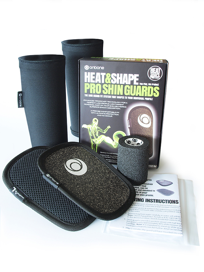
Our latest packaging design project, shown below, is for a new revolutionary shin guard for a company called Onbone.
This pack design was developed, working closely with the client, to produce a pack that would be protective of the product and look appealing to customers.
The first part of the project was to create the name and brand. This was developed following several discussions with the client and working on the specific USP of the product. As a new product which is not yet known it was vital to quickly communicate what the product is and what it does. The phrase Heat&Shape was developed for this specific purpose.
We then worked on colours. We loved the total coverage of black and how strongly this linked the brand and product together. We then developed a bright colour pallette that would work well with the black pack. The lime green and white work very well and give a strong contrast when on black. We designed strong typography to depict a strong and dynamic product in keeping with the product’s benefits. We then created a dynamic graphic image to work for the brand in presenting a hi-tech product for a hi-tech company. The neon green x-ray image of a footballer fits perfectly with the product’s ethos of dynamic sports protection while being environmentally friendly and also represents the target market.
These elements were combined to make what is a very strong brand image for the design of the packaging. The packaging design is right, the structure is right and the overall look of the packaging both graphically and for sales is right also.
We then applied the branding across the full range of marketing collateral to further emphasise brand strength.
This works very well and the client is very happy with it.